
I was hoping to have a little more time to compose something today that had a little structure. I had an idea or two this morning before my brain melted out of my ears reading through the Azure AD roles and permissions documentation and then figuring out how best to assign the lowest level of privilege to the team that required it.
Everything was going swimmingly until I realised that there is still no option to create CUSTOM ROLES! What's the damn point in having all of these (quite frankly, incredibly detailed and informative) docs if I can't do anything with the roles.
However, that rant did give me a topic to briefly mention that is quite important to me. Documentation.
This is something that is incredibly difficult to get right. Too little information and you risk hampering your or your colleagues future productivity. Too much information and someone is likely to just switch off, skim for the important parts and possibly miss fundamental steps.
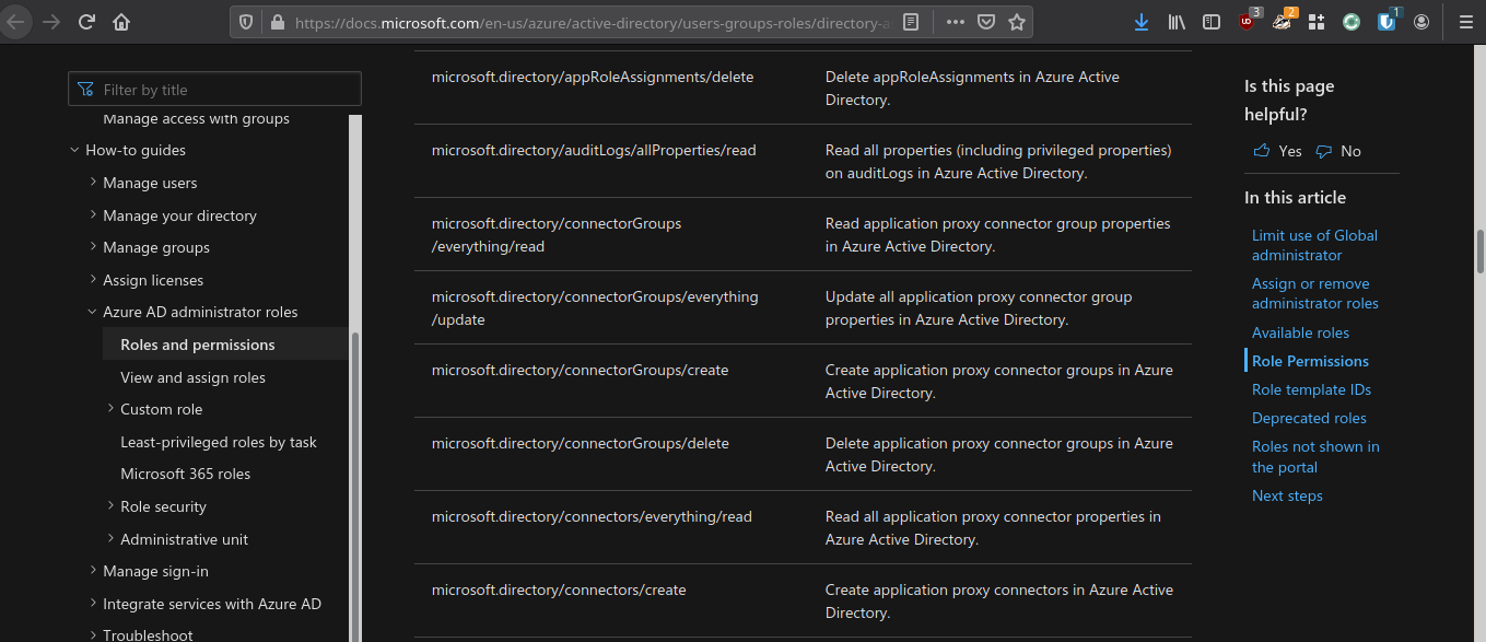
The docs that gave my brain a beating today were these: Admin role descriptions and permissions - Azure AD. As I mentioned previously, they are extremely detailed and contain almost everything you need to figure out which permissions you require. They are also incredibly long and can lead to you scrolling rapidly down the page until you see a keyword you need. The "In this article" on the side does help a lot though.
Not all of Microsoft's documentation is as helpful as this one, however.
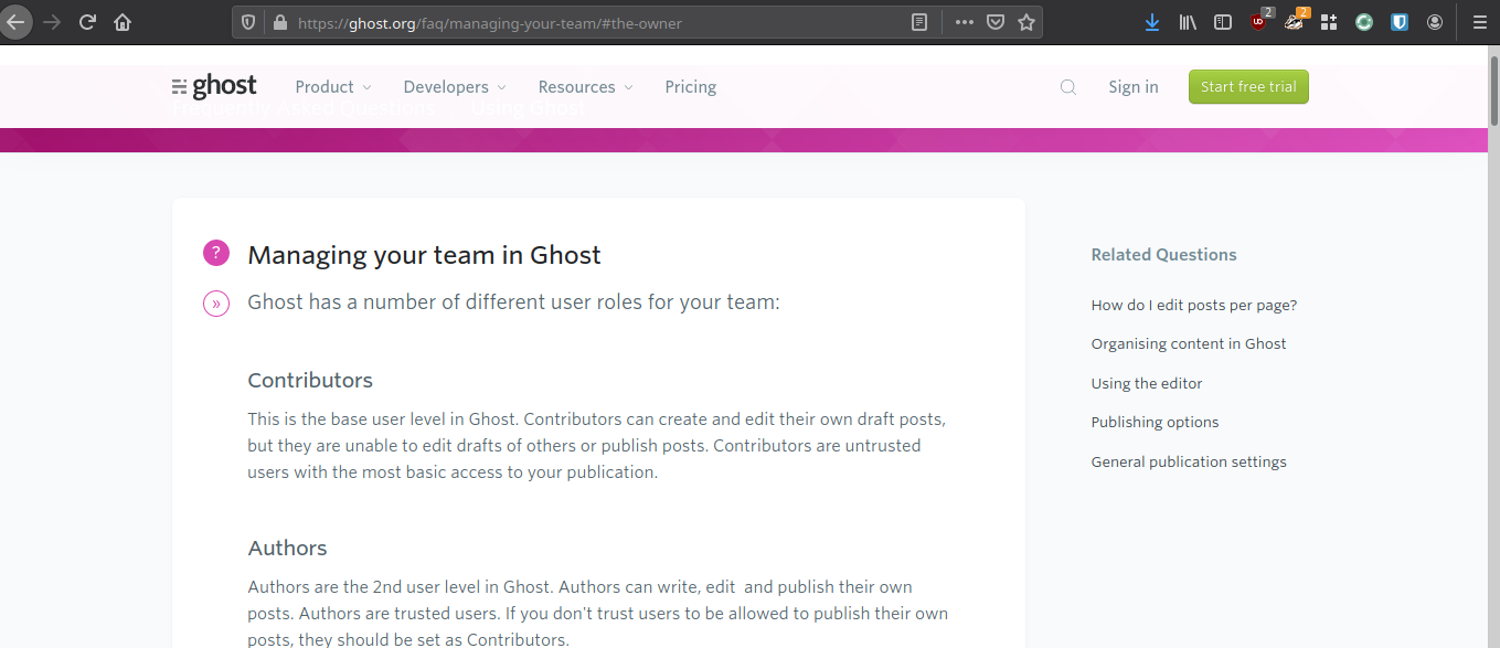
Personally, I think a fantastic example of documentation is that of Ghost Docs. They are clean, simple and mostly to the point. Perhaps it's unfair to compare the documentation for something as "simple" as Ghost to that of Azure AD permissions, but I feel like the Ghost team really nailed it.
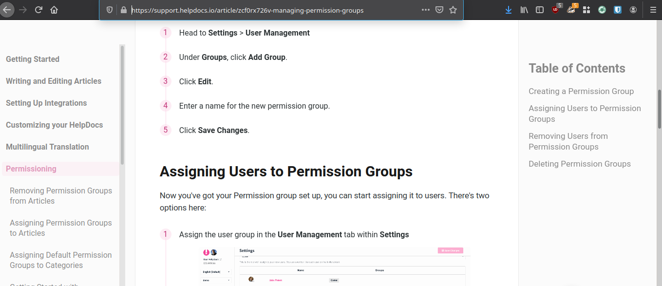
An honourable mention also goes to HelpDocs. However, on a smaller screen it can feel incredibly cramped and can make it feel a little overwhelming. Even though the information on the doc itself is clean and well presented, the menu on the left and the ToC on the right makes it seem like there is more information to read than there actually is.
I'm still trying to find the perfect balance while writing documentation for my team and I think this is something that will take many years of practice to get even remotely right.
Do you want to hear more about the documentation practices I'm (attempting) putting in to place? Do you have any great (or terrible) examples of documentation that you'd like to share?